
The Mathematical Framework
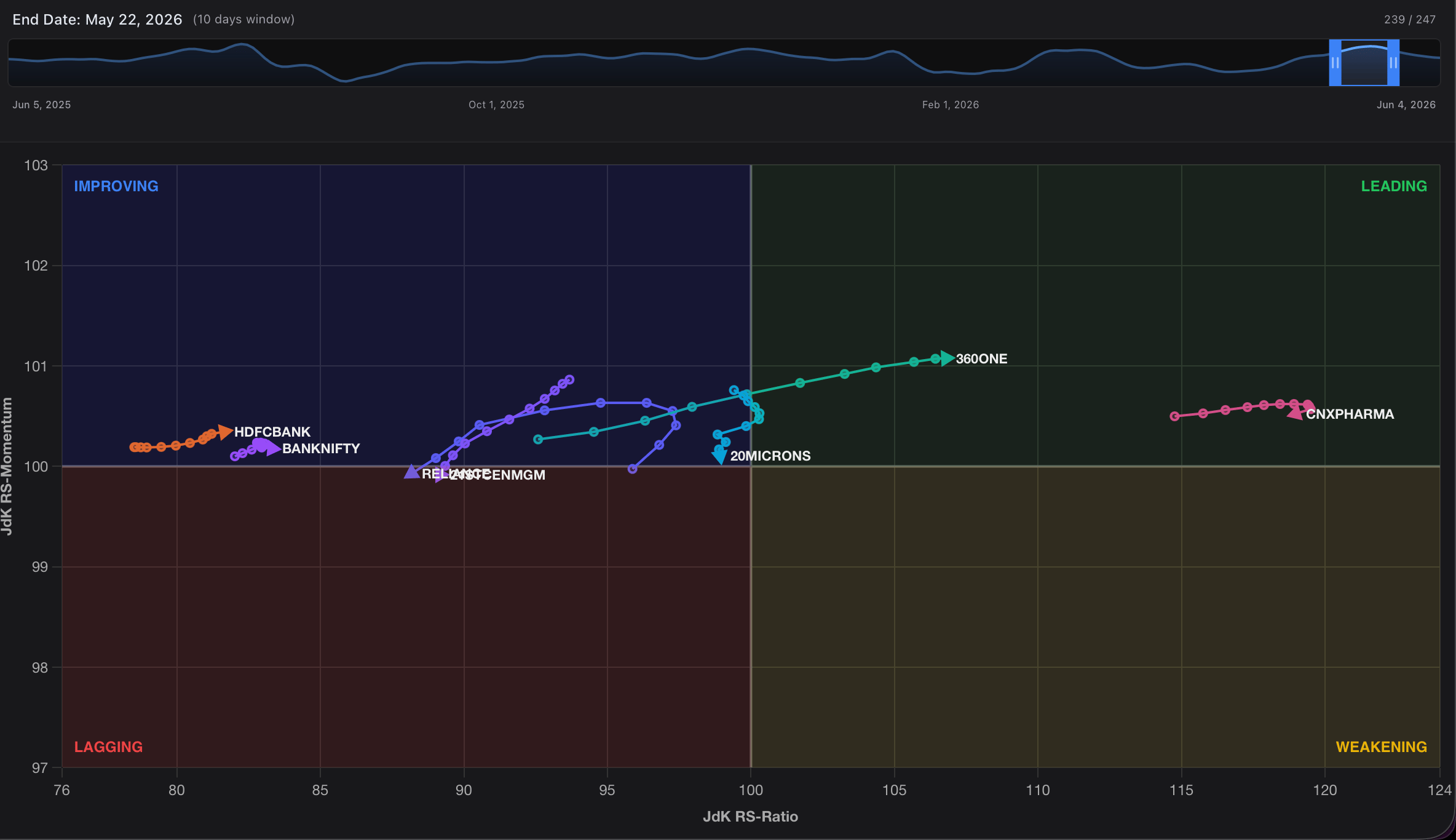
The RRG plots assets relative to a benchmark index (such as the Nifty 50) using two proprietary quantitative metrics calculated over rolling cycles:- JdK RS-Ratio (Horizontal Axis): Measures the absolute relative strength of an asset. A reading above 100 indicates the asset is structurally outperforming the benchmark.
- JdK RS-Momentum (Vertical Axis): Measures the velocity or rate of change of that relative strength. A reading above 100 indicates the asset’s outperformance is accelerating.
Market Cycle Matrix
As capital rotates through the economy, assets naturally trace a clockwise arc across the four quadrants of the RRG matrix.| Quadrant | RS-Ratio (Strength) | RS-Momentum (Momentum) | Structural Market State | Tactical Mandate |
|---|---|---|---|---|
| Leading | Confirmed Uptrend / Outperformance | Buy & Hold / Overweight | ||
| Weakening | Exhaustion / Technical Pullback | Profit-Taking / Under Watch | ||
| Lagging | Confirmed Downtrend / Underperformance | Avoid / Short-Candidate | ||
| Improving | Structural Bottoming / Trend Reversal | Early Accumulation / Watchlist |
Deep Dive: Explaining the Rotational Phases
To maximize your strategic edge, it is critical to understand the narrative behind an asset’s journey through each quadrant.Leading Quadrant (Top-Right)
Assets here possess both superior relative strength and accelerating upward momentum. They are pacing the broader market and leading the current cycle. Trend-following strategies are highly optimized here.Weakening Quadrant (Bottom-Right)
When a market leader begins to run out of steam, its upward velocity drops before its structural strength fails. On a standard price chart, the asset might still look like it’s making new highs, but the RRG will show its node dropping downward into the Weakening quadrant—offering an early warning sign that institutional distribution has commenced.Lagging Quadrant (Bottom-Left)
When both strength and momentum break down, the asset enters the Lagging quadrant. These instruments are structurally underperforming the benchmark. Capital is actively leaving these names, making them high-risk holds for long investors.Improving Quadrant (Top-Left)
This is where early alpha is discovered. Before a beaten-down stock or sector can become a market leader, institutional buyers must begin quietly accumulating it. This massive injection of capital causes its momentum to surge upward long before its absolute relative strength crosses back over the 100 line. Tracking assets moving sharply upward through the Improving quadrant allows you to execute precise entries right at the cyclical bottom.Operating the Interactive Terminal
The Kalpi RRG interface gives you granular control over historical data replay and custom universe tracking.1. Universe Curation Panel
The left sidebar serves as your command center for structuring your workspace and auditing current mathematical positions.- Bespoke Universe Mapping: Input any combination of sector indices or individual stock tickers into the “Add stock…” search utility to dynamically overlay completely different asset classes onto the same grid.
- Live Mathematical Auditing: The data grid continuously displays real-time Ratio and Mom values alongside automated color tags matching each asset’s current quadrant.
- Participation Overview: The summary panel at the bottom provides an immediate macro distribution count, letting you know at a glance if the broader market environment is structurally healthy (majority of nodes in Leading/Improving) or defensive (majority of nodes in Lagging/Weakening).
2. Playback Control & Parameter Engine
The top menu bar houses the controls required to manipulate time and fine-tune your comparative baselines.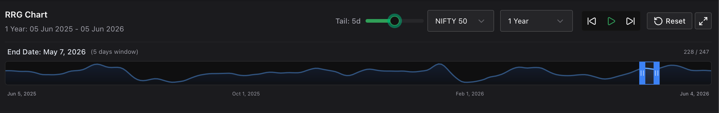
- Historical Animation Player: Click the Play button to watch the asset nodes trace their historical paths across the grid chronologically. Watching the curves and rotations develop across time reveals the exact speed and direction of capital migration.
- Timeline Scrub Window: Click and drag the interactive timeline handles to instantly isolate specific historical looking windows or evaluate exactly how your sectors behaved during past macro events.
- Tail Length Modifiers: Use the Tail slider to adjust the trailing historical node history (e.g., from
1dto10d). Longer trails make it exceptionally easy to visually map the curve, trajectory, and acceleration vector of a specific sector. - Benchmark Re-Calibration: Change the center point of your universe via the benchmark dropdown. Swapping the benchmark from the broader Nifty 50 to a specific sectoral index allows you to analyze internal stock alpha relative to its specific industry group.