
Key Breadth Indicators
Our platform tracks several critical breadth metrics in real-time so you know when to be aggressive and when to play defense:Multi-Asset Overlay
Mix and match broader Indices (like Nifty 50) directly alongside specific Sectors (like Nifty Bank) on the same charts to compare internal participation.
% Above EMAs
Shows the percentage of stocks in a universe trading above their trend. Track participation across the 20, 50, 100, and 200 Exponential Moving Averages.
Momentum Extremes
Track explosive short-term volatility (±4.5% daily) and sustained capital inflows or outflows (±20% weekly) across your selected asset groups.
Near 52W High/Low
Measures how many stocks are trading within 5% of their 52-week highs (indicating expansion) compared to those bottoming out near 52-week lows.
Deep-Dive Analysis Tools
The dashboard is built to give you precise visual control over how you analyze these internal trends.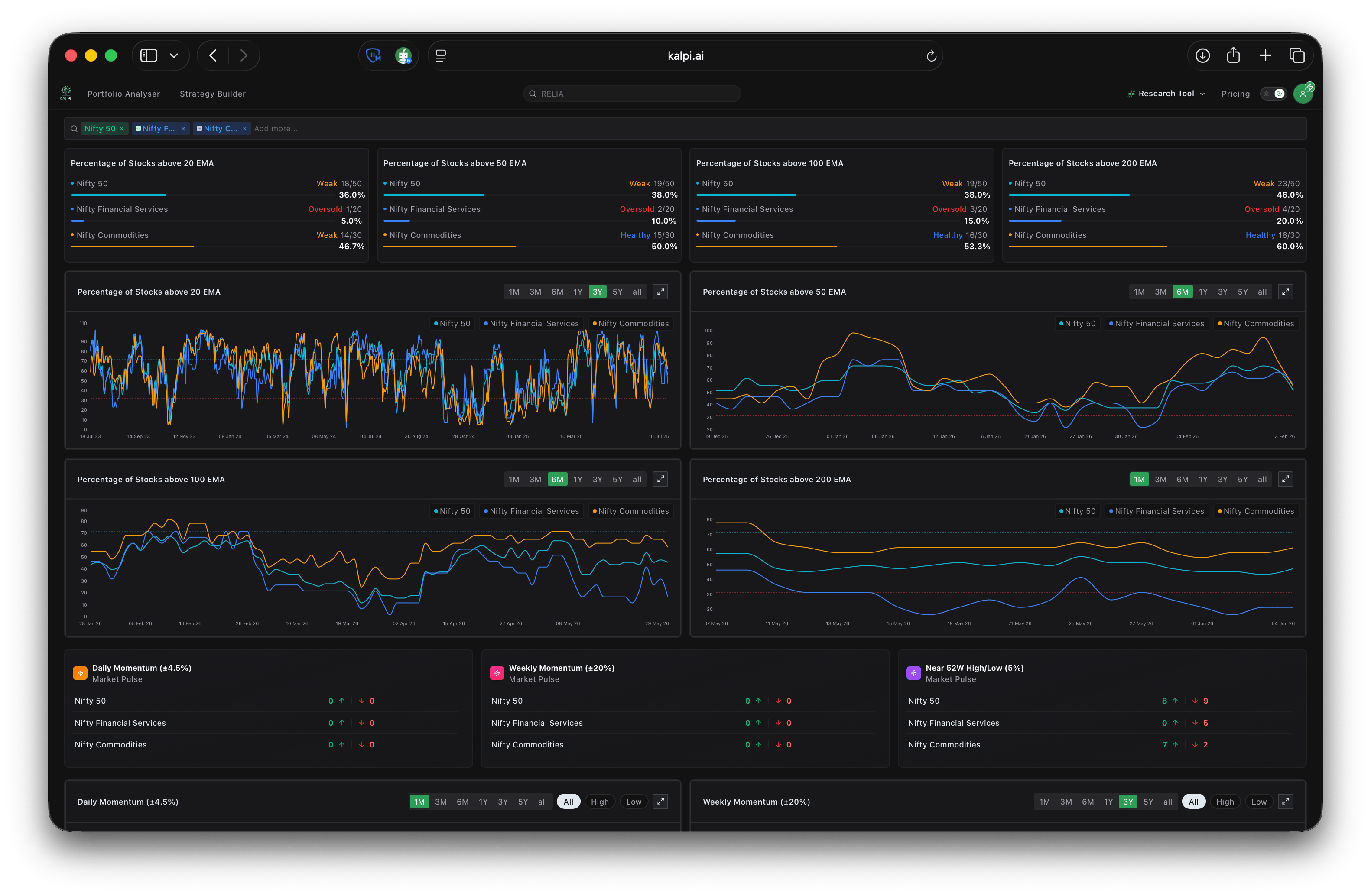
- Trend Health Classifications: At a glance, the top moving average cards classify the current percentage of stocks trading above key averages as either Weak or Healthy.
- Historical Line Charts: Track how EMA participation expands and contracts over time. Use the timeframe toggles (from 1M up to 5Y and All) to zoom in on short-term divergences or out to view multi-year structural cycles.
- High/Low Isolation: All of the momentum and 52-week charts feature targeted toggle switches at the top right. You can filter the visual data to show All metrics, or isolate the view to only show the High (positive) or Low (negative) bars for cleaner analysis.