> ## Documentation Index
> Fetch the complete documentation index at: https://kalpi.ai/docs/llms.txt
> Use this file to discover all available pages before exploring further.
# Market Breadth
> Gauge the true underlying health of the broader market.
While an index like the Nifty 50 might be pushing to all-time highs, the surface-level price does not always tell the whole story. A few heavily weighted stocks can mask weakness in the broader market.
Kalpi’s **Market Breadth** tool provides a clear X-ray of the market’s true health.
## Key Breadth Indicators
Our platform tracks several critical breadth metrics in real-time so you know when to be aggressive and when to play defense:
Mix and match broader Indices (like Nifty 50) directly alongside specific Sectors (like Nifty Bank) on the same charts to compare internal participation.
Shows the percentage of stocks in a universe trading above their trend. Track participation across the 20, 50, 100, and 200 Exponential Moving Averages.
Track explosive short-term volatility (±4.5% daily) and sustained capital inflows or outflows (±20% weekly) across your selected asset groups.
Measures how many stocks are trading within 5% of their 52-week highs (indicating expansion) compared to those bottoming out near 52-week lows.
***
## Deep-Dive Analysis Tools
The dashboard is built to give you precise visual control over how you analyze these internal trends.
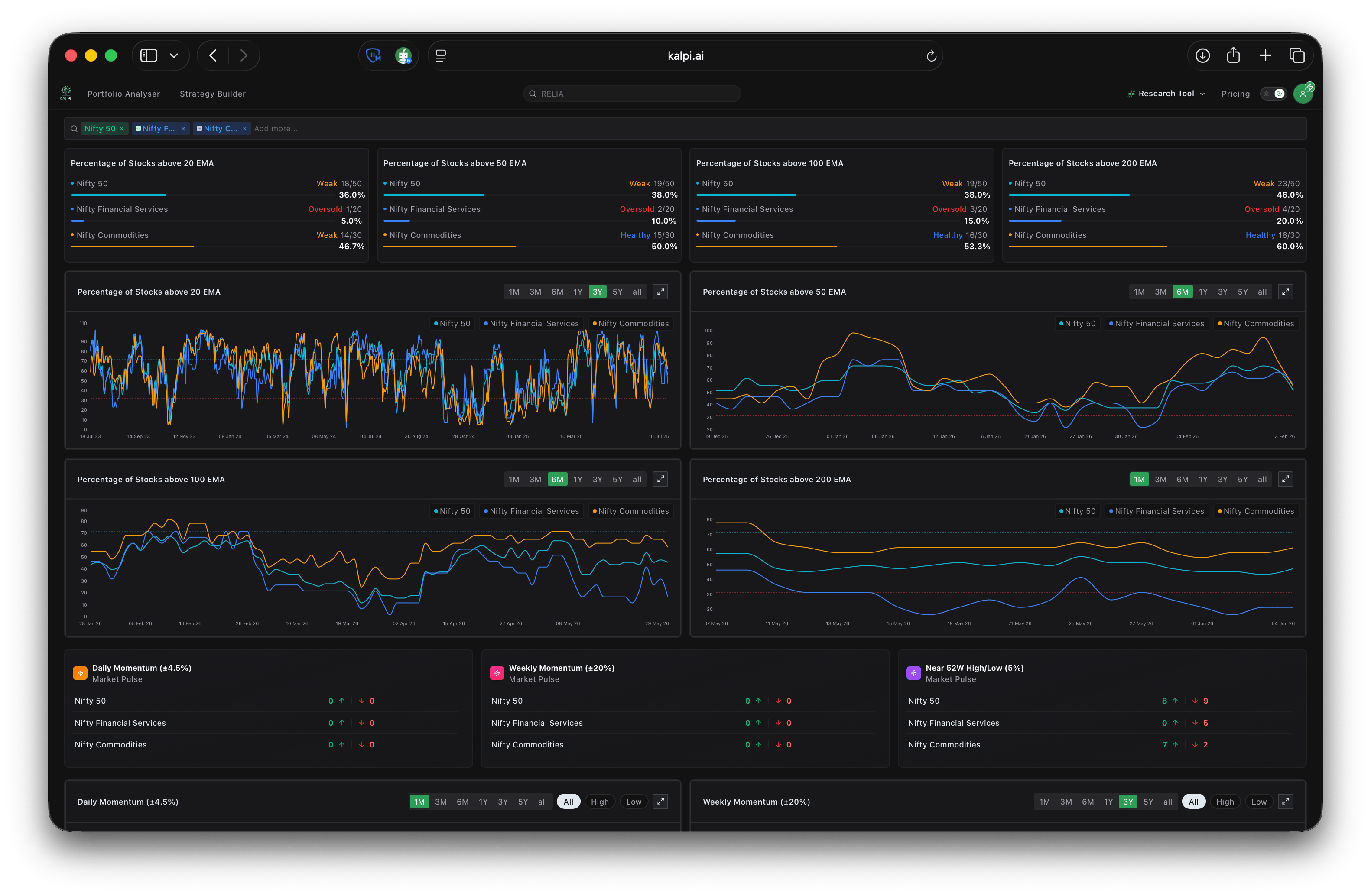 * **Trend Health Classifications:** At a glance, the top moving average cards classify the current percentage of stocks trading above key averages as either *Weak* or *Healthy*.
* **Historical Line Charts:** Track how EMA participation expands and contracts over time. Use the timeframe toggles (from **1M** up to **5Y** and **All**) to zoom in on short-term divergences or out to view multi-year structural cycles.
* **High/Low Isolation:** All of the momentum and 52-week charts feature targeted toggle switches at the top right. You can filter the visual data to show **All** metrics, or isolate the view to only show the **High** (positive) or **Low** (negative) bars for cleaner analysis.
* **Trend Health Classifications:** At a glance, the top moving average cards classify the current percentage of stocks trading above key averages as either *Weak* or *Healthy*.
* **Historical Line Charts:** Track how EMA participation expands and contracts over time. Use the timeframe toggles (from **1M** up to **5Y** and **All**) to zoom in on short-term divergences or out to view multi-year structural cycles.
* **High/Low Isolation:** All of the momentum and 52-week charts feature targeted toggle switches at the top right. You can filter the visual data to show **All** metrics, or isolate the view to only show the **High** (positive) or **Low** (negative) bars for cleaner analysis.